![[Deprecated]](figures/lifecycle-deprecated.svg)
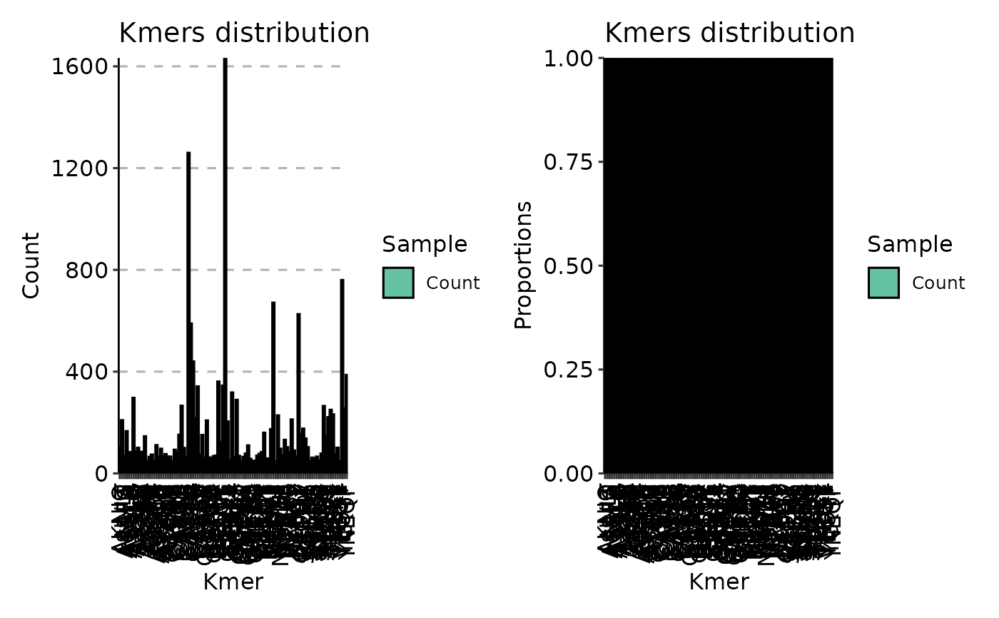
Plot a distribution (bar plot) of the most frequent kmers in a data.
Arguments
- .data
Data frame with two columns "Kmers" and "Count" or a list with such data frames. See Examples.
- .head
Number of the most frequent kmers to choose for plotting from each data frame.
- .position
Character vector of length 1. Position of bars for each kmers. Value for the
ggplot2argumentposition.- .log
Logical. If TRUE then plot log-scaled plots.
- ...
Not used here.