![[Deprecated]](figures/lifecycle-deprecated.svg)
Usage
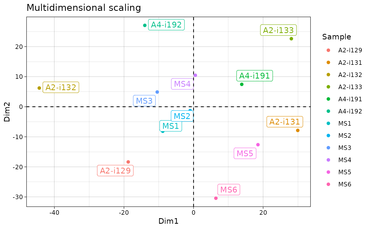
# S3 method for class 'immunr_mds'
vis(
  .data,
  .by = NA,
  .meta = NA,
  .point = TRUE,
  .text = TRUE,
  .ellipse = TRUE,
  .point.size = 2,
  .text.size = 4,
  ...
)
Arguments
- .data
Output from analysis functions such as geneUsageAnalysis or immunr_pca, immunr_mds or immunr_tsne.
- .by
Pass NA if you want to plot samples without grouping.
You can pass a character vector with one or several column names from ".meta" to group your data before plotting. In this case you should provide ".meta".
You can pass a character vector that exactly matches the number of samples in your data, each value should correspond to a sample's property. It will be used to group data based on the values provided. Note that in this case you should pass NA to ".meta".
- .meta
A metadata object. An R dataframe with sample names and their properties, such as age, serostatus or hla.
- .point
Logical. If TRUE then plot points corresponding to objects.
- .text
Logical. If TRUE then plot sample names.
- .ellipse
Logical. If TRUE then plot ellipses around clusters of grouped samples.
- .point.size
Numeric. A size of points to plot.
- .text.size
Numeric. A size of sample names' labels.
- ...
Not used here.
Details
Other visualisation methods:
PCA - vis.immunr_pca
MDS - vis.immunr_mds
tSNE - vis.immunr_tsne
Examples
# \dontrun{
data(immdata)
ov <- repOverlap(immdata$data)
repOverlapAnalysis(ov, "mds") %>% vis()

# }
# }