![[Deprecated]](figures/lifecycle-deprecated.svg)
Visualise distributions of genes using heatmaps or other plots.
Arguments
- .data
Output from the geneUsage function.
- .plot
String specifying the plot type:
"hist" for histograms using vis_hist;
"heatmap" for heatmaps using vis_heatmap;
"heatmap2" for heatmaps using vis_heatmap2;
"circos" for circos plots using vis_circos.
- ...
Other arguments passed to corresponding functions depending on the plot type:
"hist" - passes arguments to vis_hist;
"box" - passes arguments to vis_box;
"heatmap" - passes arguments to vis_heatmap;
"heatmap2" - passes arguments to vis_heatmap2 and heatmap from the "pheatmap" package;
"circos" - passes arguments to vis_circos and circlize::chordDiagram from the "circlize" package.
Examples
# \dontrun{
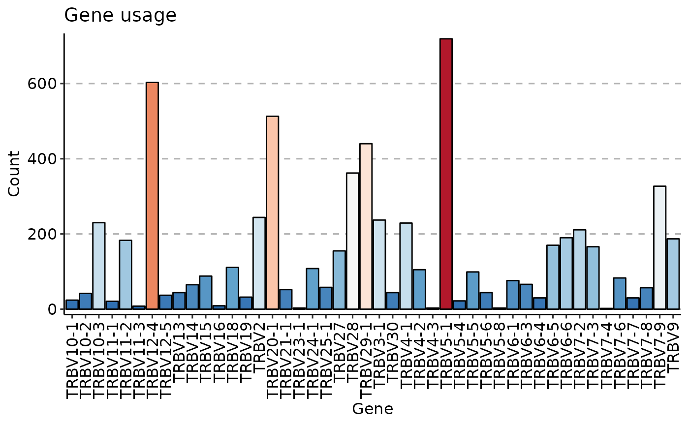
data(immdata)
gu <- geneUsage(immdata$data[[1]])
vis(gu)
#> Using Names as id variables
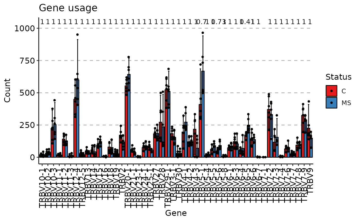
 gu <- geneUsage(immdata$data)
vis(gu, .by = "Status", .meta = immdata$meta)
#> Using Names as id variables
#> Warning: Removed 15 rows containing non-finite outside the scale range
#> (`stat_compare_means()`).
#> Warning: Removed 15 rows containing missing values or values outside the scale range
#> (`geom_point()`).
#> Warning: Removed 1 row containing missing values or values outside the scale range
#> (`geom_text()`).
gu <- geneUsage(immdata$data)
vis(gu, .by = "Status", .meta = immdata$meta)
#> Using Names as id variables
#> Warning: Removed 15 rows containing non-finite outside the scale range
#> (`stat_compare_means()`).
#> Warning: Removed 15 rows containing missing values or values outside the scale range
#> (`geom_point()`).
#> Warning: Removed 1 row containing missing values or values outside the scale range
#> (`geom_text()`).
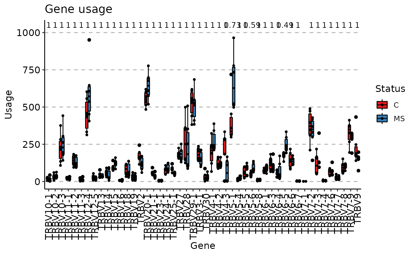
 vis(gu, "box", .by = "Status", .meta = immdata$meta)
#> Using Names as id variables
#> Warning: Removed 15 rows containing non-finite outside the scale range
#> (`stat_boxplot()`).
#> Warning: Removed 15 rows containing non-finite outside the scale range
#> (`stat_compare_means()`).
#> Warning: Removed 15 rows containing missing values or values outside the scale range
#> (`geom_point()`).
#> Warning: Removed 1 row containing missing values or values outside the scale range
#> (`geom_text()`).
vis(gu, "box", .by = "Status", .meta = immdata$meta)
#> Using Names as id variables
#> Warning: Removed 15 rows containing non-finite outside the scale range
#> (`stat_boxplot()`).
#> Warning: Removed 15 rows containing non-finite outside the scale range
#> (`stat_compare_means()`).
#> Warning: Removed 15 rows containing missing values or values outside the scale range
#> (`geom_point()`).
#> Warning: Removed 1 row containing missing values or values outside the scale range
#> (`geom_text()`).
 # }
# }