![[Deprecated]](figures/lifecycle-deprecated.svg)
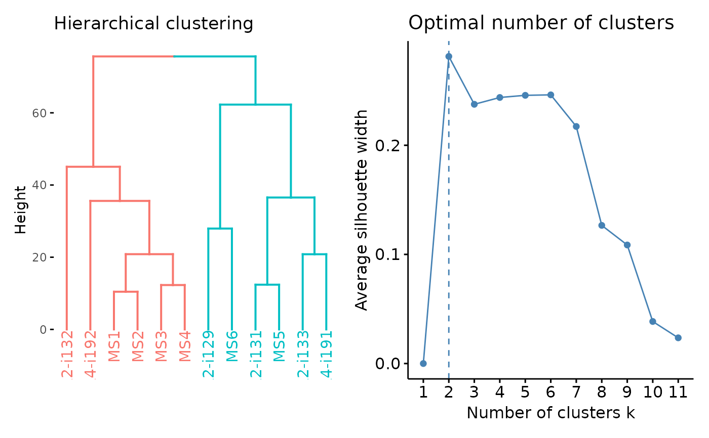
Visualisation of the results of hierarchical clustering. For other clustering visualisations see vis.immunr_kmeans.
Arguments
- .data
Clustering results from repOverlapAnalysis or geneUsageAnalysis.
- .rect
Passed to factoextra::fviz_dend - whether to add a rectangle around groups.
- .plot
A character vector of length one or two specifying which plots to visualise. If "clust" then plot only the clustering. If "best" then plot the number of optimal clusters. If both then plot both.
- ...
Not used here.
Examples
# \dontrun{
data(immdata)
ov <- repOverlap(immdata$data)
repOverlapAnalysis(ov, "mds+hclust") %>% vis()

# }
# }