![[Deprecated]](figures/lifecycle-deprecated.svg)
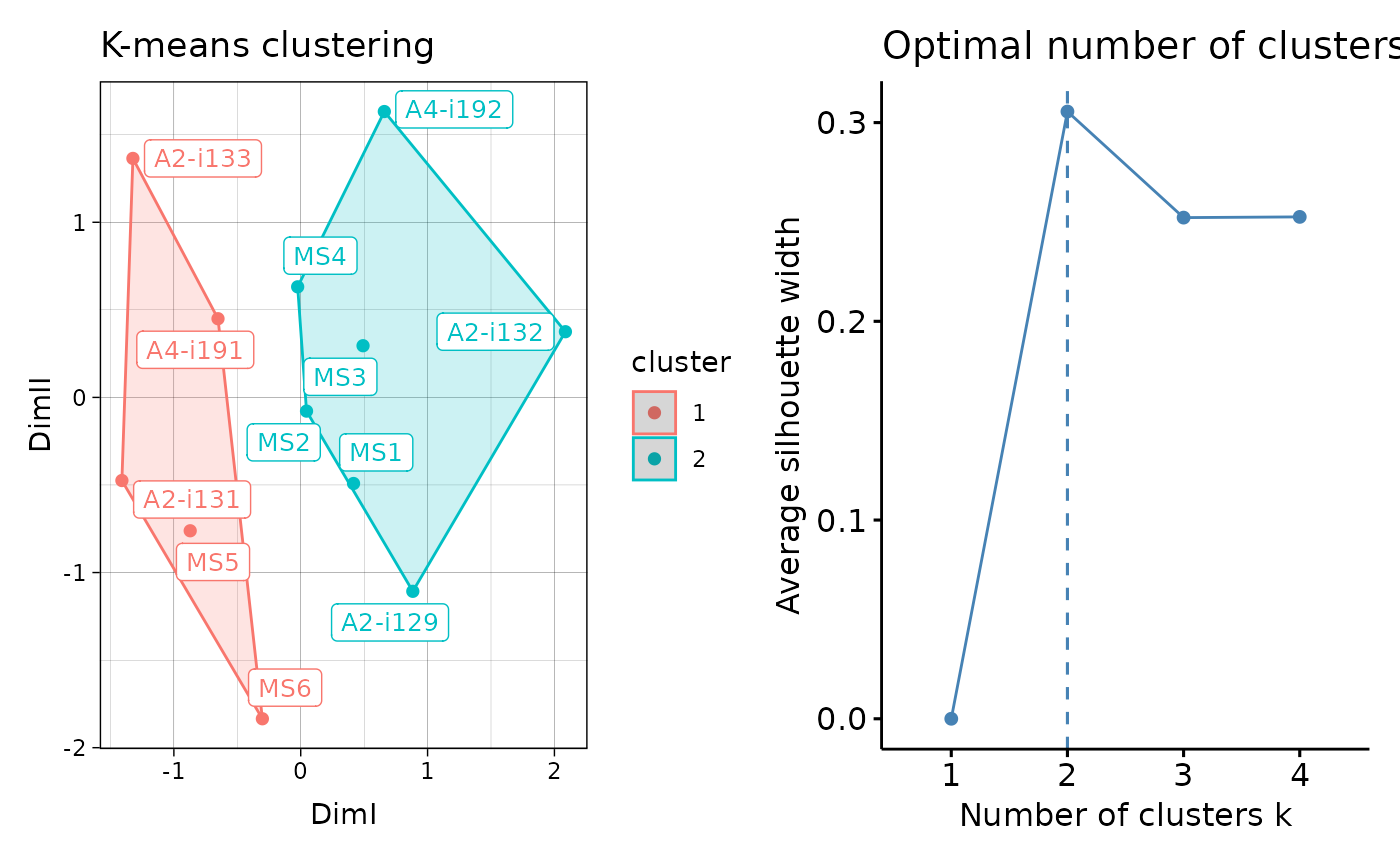
Visualisation of the results of K-means and DBSCAN clustering. For hierarhical clustering visualisations see vis.immunr_hclust.
Arguments
- .data
Clustering results from repOverlapAnalysis or geneUsageAnalysis.
- .point
If TRUE then plot sample points. Passed to factoextra::fviz_cluster.
- .text
If TRUE then plot text labels. Passed to factoextra::fviz_cluster.
- .ellipse
If TRUE then plot ellipses around all samples. Passed to "ellipse" from factoextra::fviz_cluster.
- .point.size
Size of points, passed to "pointsize" from factoextra::fviz_cluster.
- .text.size
Size of text labels, passed to labelsize from factoextra::fviz_cluster.
- .plot
A character vector of length one or two specifying which plots to visualise. If "clust" then plot only the clustering. If "best" then plot the number of optimal clusters. If both then plot both.
- ...
Not used here.
Examples
# \dontrun{
data(immdata)
ov <- repOverlap(immdata$data)
repOverlapAnalysis(ov, "mds+kmeans") %>% vis()

# }
# }